What is a coaching website actually for?
Converting an interested visitor into a booked call. Not establishing credibility in the abstract, not showcasing your personality, and not looking as professional as the competition. Those things matter only insofar as they move somebody toward the calendar.
This single-purpose framing is what separates sites that book calls from sites that get complimented. A visitor arrives with a problem and a limited amount of patience. Everything on the page either helps them decide or delays the decision, and there is no neutral category.
Here is the contrarian position: your website is probably not your problem. Most coaches redesigning their site are avoiding a harder question about who they serve and what they sell. A beautiful site with vague positioning converts worse than a plain site with a specific promise, and the redesign feels like progress while changing nothing that matters.
What belongs above the fold?
Who you help, what changes for them, and one action. Three elements. A visitor should be able to determine whether this site is for them without scrolling, and if they cannot, most will leave rather than investigate.
| Common | Better | Why |
|---|---|---|
| "Transform your life" | "I help agency owners get out of delivery" | Names the person and the change |
| A large portrait photograph | A sentence stating the outcome | Text answers the question, images do not |
| "Learn more" | "Book a free 30 minute call" | Specific action, bounded commitment |
| Full navigation menu | One or two links maximum | Every extra link is an alternative to converting |
| A carousel of messages | One message | Three rotating promises read as no promise |
The photograph question comes up constantly, so it is worth being precise. Photographs of you are valuable on a coaching site because people are buying a relationship with a person. They are simply not the first thing somebody needs. Put the sentence first and the photograph beside it, rather than the photograph first and the sentence underneath.
What order should the sections go in?
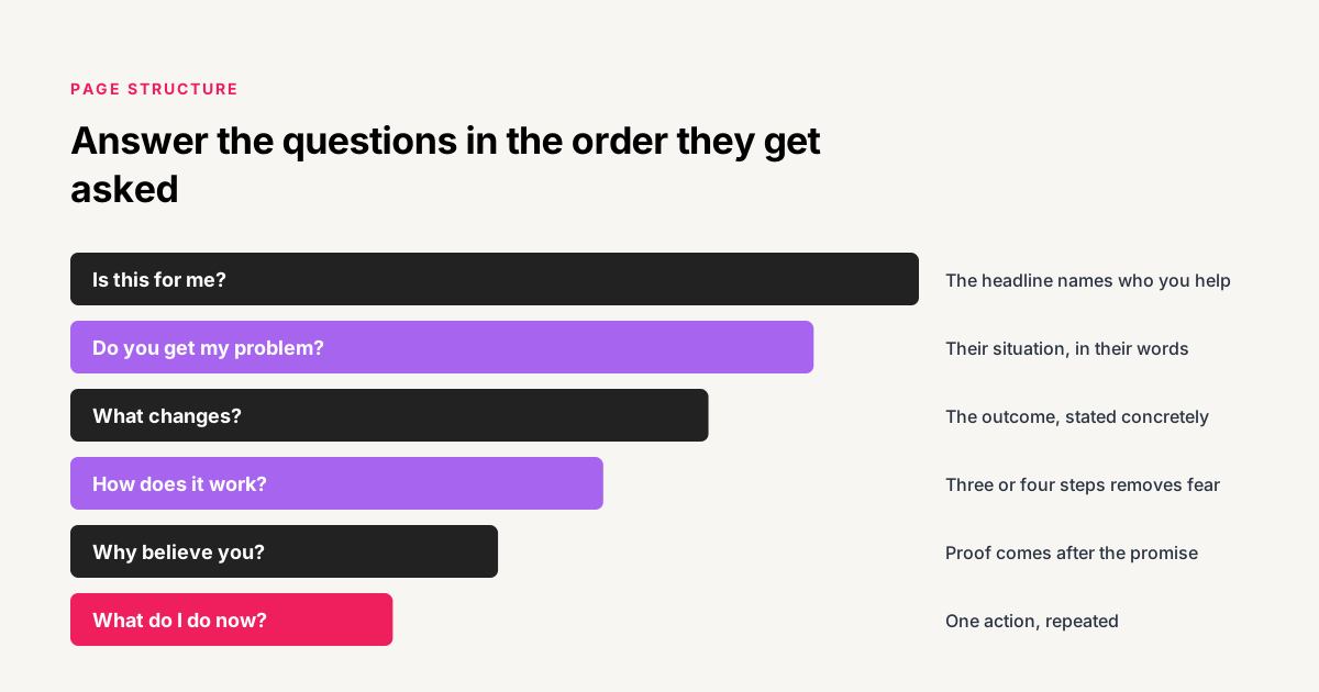
Follow the sequence of questions a visitor asks silently as they scroll. Deviating from that order forces them to hold an unanswered question while reading something else, which is the mechanism behind most page abandonment.
- Is this for me? The headline names who you help. Everything below depends on the visitor answering yes here.
- Do you understand my problem? Describe their situation in their words, more precisely than they expected. This is where trust starts.
- What changes if I work with you? The outcome, stated concretely. Not your methodology.
- How does it work? The process in three or four steps. This removes fear of the unknown, which is a larger obstacle than price for most coaching purchases.
- Why should I believe you? Proof. Named clients, specific results, real reviews. This comes after the promise, never before it.
- What if I am not sure? Objections answered plainly, including who this is not for.
- What do I do now? One action, repeated. The same booking link that appeared at the top.
Step six does more work than its position suggests. Explicitly naming who you are not right for increases conversion among the people you are right for, because a page that turns somebody away is a page making a genuine claim rather than a universal one.
What kind of proof actually persuades?
Specific, attributable and about a situation the reader recognizes. A named person with a real role and a concrete before and after outperforms any number of anonymous five-star quotes, because anonymity is indistinguishable from invention.
- Named testimonials with roles. "Ruth Kiire, work-life mastery coach" is checkable. "Sarah M." is not.
- Video reviews. Difficult to fabricate, which is precisely why they carry weight.
- Full case studies. What was broken, what was built, what happened. The narrative form persuades where a quote cannot.
- Verified third-party reviews. Worth more than anything on your own site, because somebody else vouched for the reviewer being real.
- A link to the client's profile. Costs nothing and converts a claim into something verifiable in one click.
What to avoid is any number you cannot defend. "Over 500 clients served" is unverifiable and reads as filler. Worse, a visitor who doubts one claim discounts the rest of the page, which means an unsupportable statistic costs more than the credibility it was meant to buy.
The same logic applies to star ratings and aggregate scores. If the reviews were collected on your own site and never verified by anyone, publishing an average is a claim about yourself dressed up as data. Individual named reviews are stronger and carry no such problem.
What should you remove from your coaching website?
Anything that offers the visitor a route other than the one you want them to take. Removal is usually the higher-return edit, and it is the one nobody enjoys making, since every element was added for a reason that seemed good at the time.
- Extra navigation. Every menu item is an alternative to booking. Landing pages should have almost none.
- Carousels. Visitors read the first slide and scroll. The rest is work nobody sees.
- Long biographies above the fold. Your background is proof, and proof comes after the promise.
- Multiple competing calls to action. Book a call, download the guide, join the newsletter, follow on Instagram. Four options produce fewer conversions than one.
- Stock photography of strangers. It signals that nothing on the page was made specifically.
- Pricing tables for bespoke work. If the engagement varies, a table invites people to disqualify themselves on incomplete information.
The fourth is the most common and the most expensive. Every additional call to action divides attention rather than capturing more of it, and the usual outcome is a visitor who takes none of them because choosing felt like work.
Does site speed and technical setup matter?
Yes, and for a reason that has become more important recently. Speed affects whether a visitor stays, which is well understood. What is newer is that how your site is built determines whether AI answer engines can read it at all.
Most AI crawlers do not run JavaScript. If your site renders its content client-side, which many page builders and single-page frameworks do by default, those crawlers receive an almost empty document. The site looks complete to every human and is invisible to the systems increasingly recommending providers to buyers.
The wider set of requirements is covered in our guide to generative engine optimization, and this is part of why we build sites rather than only designing them, as conversion focused website design.
Which platform should you build on?
Whichever one you will actually keep updated, provided it renders content server-side. Platform choice matters far less than structure and copy, and agonizing over it is another comfortable way to avoid the positioning question.
The practical requirements are short. It must produce real HTML that a crawler can read without executing scripts. It must let you edit copy without a developer, because a page you cannot change is a page that goes stale. It must load quickly on mobile, where most of your traffic arrives. And it must let you add a booking link and a capture form wherever you need them.
Nearly every mainstream option satisfies these. Where sites fail is almost never the platform, it is a template chosen for how it looked in the preview rather than for whether its structure matches the order in which visitors ask questions.
How should you write the copy?
In the words your clients use, not the words your profession uses. This is the difference between a page that feels written for the visitor and one that feels written by somebody protecting their expertise.
There is a reliable source for this language and almost nobody uses it. Go through your discovery call notes, your intake forms, and the emails clients sent you before they hired you. The phrases people use to describe their own problem, before you have taught them your framework, are the phrases that belong on the page.
| How you describe it | How they describe it |
|---|---|
| Executive presence coaching | I freeze up in leadership meetings |
| Strategic clarity work | I have no idea what to focus on next |
| Operational efficiency review | Everything still runs through me |
| Boundary setting | I cannot say no and it is wrecking my weekends |
| Scaling support | I hired people and somehow got busier |
The right column converts. It also gets found, because those are the phrases people type into search and into AI assistants when they are looking for help and do not yet know what the service is called. Your professional terminology is the vocabulary of somebody who has already been through your process.
Write in second person throughout. Address one reader, not an audience. A page saying "you" reads as a conversation, and a page saying "clients" or "individuals" reads as a brochure describing people who are not currently present.
What happens to visitors who are not ready to book?
Most of them. This is the number that surprises people and the gap that costs the most. The overwhelming majority of visitors to a coaching site are interested and not yet ready, and a site offering only a booking link treats every one of them as a loss.
The fix is a second, lower-commitment option that captures contact details. A useful resource in exchange for an email means an interested visitor becomes somebody you can follow up with for months rather than somebody who visited once. Our guide to lead magnet ideas that convert covers what to offer.
Then the follow-up has to exist, which is where most sites stop. A captured email with no sequence behind it is an address in a database. The structure is in our guide to the B2B email nurture sequence, and the whole path is in our guide to client acquisition strategy. We build the capture pages and the sequences together as lead magnets and funnel builds, because separating them is what produces a list nobody follows up with.
What does this look like on a real site?
Eddie Perez runs a fitness coaching practice and was already publishing content that people watched. The audience existed. The website did not convert any of it.
The pattern generalizes. In almost every case we audit, the traffic was already arriving and the page it landed on gave it nowhere to go. That is a structural problem rather than an aesthetic one, which is why redesigns so often fail to change anything.
The order to fix things in
If you are looking at your own site now and want a sequence, work in order of how much each change affects everything else. Copy first, because a page saying the wrong thing beautifully is worse than one saying the right thing plainly. Structure second, so the sections answer questions in the order they get asked.
Capture third. This is the change that alters what happens to traffic you already have, rather than trying to get more of it, and it is usually an afternoon of work rather than a project. Follow-up fourth, since a capture point with nothing behind it collects addresses instead of building a pipeline.
Design last, and only where it actively obstructs one of the four above. Most coaches do this list in exactly reverse order, starting with the redesign and never reaching the copy, which is why the new site converts about as well as the old one did.
Frequently asked questions
How many pages should a coaching website have?
Four or five is enough for most coaches: a homepage, a page describing what you do, proof, an about page and a booking page. More pages spread thin content across more URLs, which weakens each one. Depth on a few pages beats a large site with nothing substantial on it.
Should you show pricing on a coaching website?
Show it if your offer is standardized and the number is unlikely to shock. Omit it if engagements vary meaningfully, because a figure without context invites people to disqualify themselves on incomplete information. If you omit it, say what the investment depends on so the absence does not read as evasion.
Do you need a blog as a coach?
Only if you will maintain it. Three abandoned posts from two years ago actively signal a stalled business. A blog that is genuinely kept up is one of the strongest ways to be found in both conventional search and AI answers, but the requirement is consistency rather than launching one.
How important is mobile design?
It is the primary design, not an adaptation. Most traffic from social platforms arrives on a phone, so the mobile view is what most visitors experience. Design there first and expand outward, rather than designing on a large screen and checking mobile afterwards.
Should the booking form ask qualifying questions?
Yes, a few. Three or four short questions filter out obvious mismatches and increase the perceived value of the time being offered. The people deterred by four questions were rarely going to become clients, and the answers make the call itself considerably more productive.
How often should you redesign your website?
Rarely. Change the copy when your positioning changes, which is frequent, and the design when it genuinely obstructs something, which is rare. Most redesigns are a way of feeling productive about marketing without confronting the harder question of who you serve and what you sell.
Published . Last updated . 2,690 words.